Think of a trade show as a miniature city and each booth as a business meeting location. Like a city, it can be a confusing place for a visitor, who may end up aimlessly wandering the aisles leading past blocks of booths and tables while trying to find their destination. So many exhibits look the same, or their displays overload the viewer with such clutter that nothing can stand out.
The right signage smooths the flow of traffic to the booths and helps attendees engage more fully with the entire show. Here is a helpful guide for trade show organizers on how to maximize signage and some tips to offer exhibitors:
Integrate event signage with the host company’s brand.
Work with the organizer to create a look and feel that strengthens the overall aesthetic and enhances the attendees’ experience. It’s like hosting a themed party or event; everything, down to the smallest detail, must resonate with the theme.
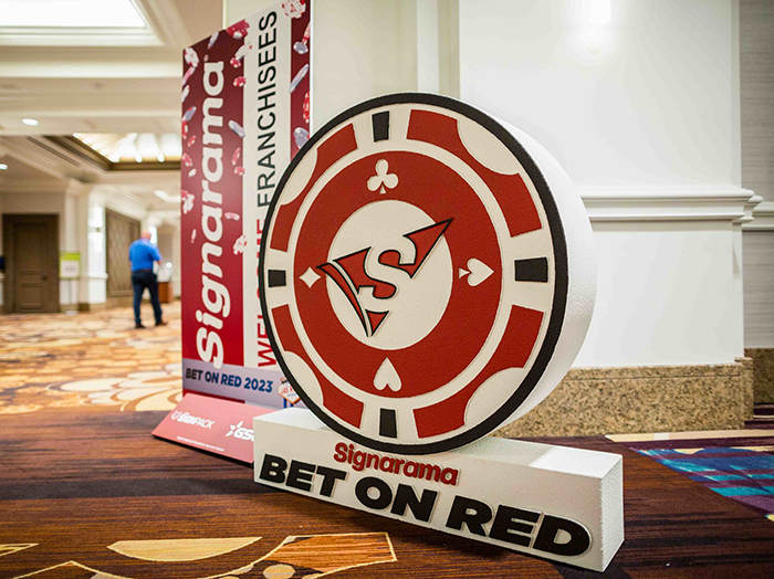
Help attendees navigate effortlessly.
You want attendees to easily find their way from one spot to another, not just from the parking lot to the event floor or from booth to booth. Along with directional signs for parking, check-ins and booths, don’t forget charging stations, restrooms and food courts, which are often overlooked. The more easily your attendees can get around, the more they’ll engage with the event.
Look for opportunities to get creative.
Directional signs should be simple and clear, but they don’t have to be boring. Besides using them for the show as a whole, think about offering these in premium packages for your exhibitors:
· Retractable banners: Versatile and easy to transport, with floor and tabletop sizes that quickly close like a rollup window shade.
· Tents: Ideal for creating hospitality areas where your exhibitors can meet with clients.
· Step-and-repeats: A branded photo background with a high engagement level, giving attendees a red-carpet experience and creating instant social media marketing.
· Stretch table covers: Neat and clean, they’re a subtle branding device but make the table pop.
· Digital, video and other technology: Lots of choices here, from promotional videos to digital signs that can be updated on the fly with artificial intelligence applications so you can devote full attention to your visitors.
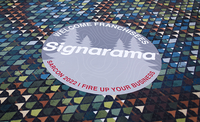
· Floor decals: An underrated tool, perfect for guiding foot traffic.
Help exhibitors stand out and fit in.
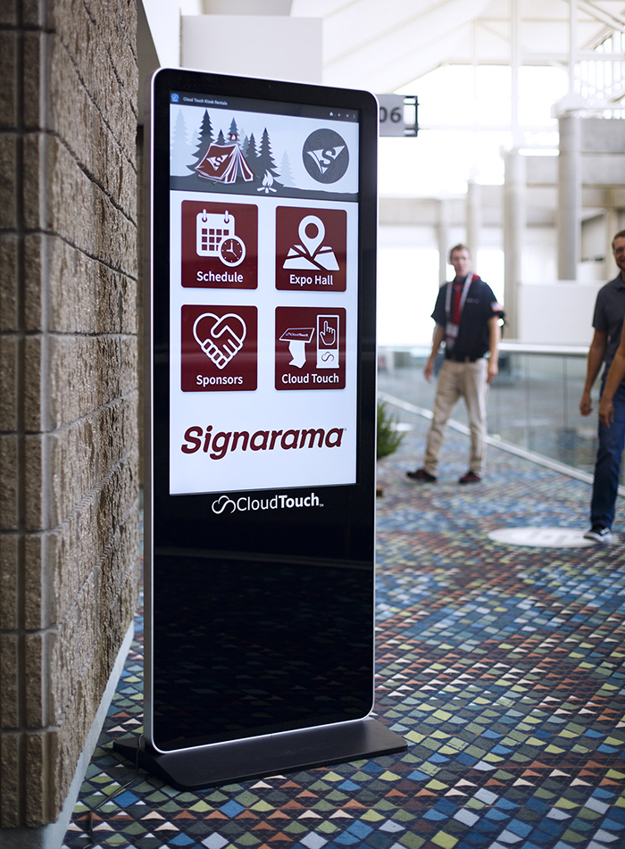
All your painstaking attention to detail will be meaningless if exhibitors don’t make the same effort. While many exhibitors do recognize the value of well-executed signage, some miss the mark with pitfalls like cluttered designs, unclear messaging or tiny, indistinct fonts. Offer some guidance to your participants with these simple rules for effective signage (and be sure to apply them yourself):
· Keep it short and simple: Follow the “5-second rule.”
In our fast-paced world, clarity and brevity reign supreme. If an attendee can’t grasp your message within five seconds, you might lose them.
· Use high-contrast colors and fonts.
While black and white is timeless, playing with contrasting colors that align with your brand can be just as striking. If using a white background, the text should be dark for readability.
· Give a strong call to action.
Guide your audience clearly with a single specific action you want them to take. Whether you’re asking them to learn more, visit a website or step into your booth, accuracy is key.
· Less is more.
Overwhelming attendees with too many signs can be counterproductive. Find a balance, focusing on one primary message and two or three secondary ones.
· Placement matters.
Your signage isn’t just about being seen; it’s about resonating with attendees at the right time and place. Put your primary message at eye level and in high foot traffic areas.
Signage isn’t just a decorative element, it’s a communication tool. As the world becomes more digital, the tangible touchpoint that signs offer at trade shows becomes even more valuable. The right signage will help attendees and exhibitors engage to the fullest and experience everything you want them to discover at your show. So, invest wisely, design thoughtfully and let your signs do the talking.


Add new comment